
I once found myself at Macy’s checking out alternative bow tie options for my then upcoming nuptials, when I stumbled upon this display rack of bow tie + pocket square combinations from Tommy Hilfiger.
I was pleasantly surprised at most of the pairings that were put together.
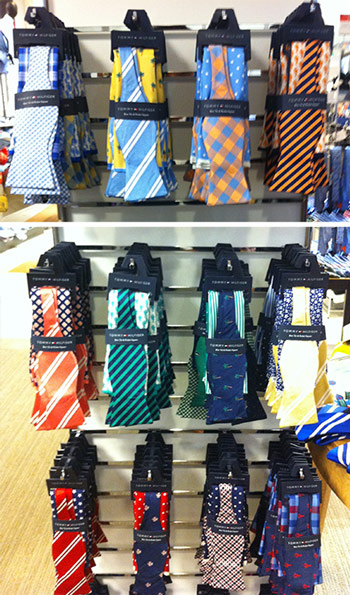
This display is a perfect example of how to complement color and pattern instead of matching exactly.
(Pardon the blurry photo; the sales associates were starting to give me the stink eye.)
Contrast this with most tie pocket square combinations you see, where the tie material exactly matches the pocket square material.
Stay away from those.
You don’t have to buy these sets from Mr. Hilfiger to achieve the same effect. Simply keep this principle in mind.
The Fool-Proof Method for “matching”
First off, remove this idea of matching from your head. You don’t want to exactly match anything, ever. Instead, what you want to do is complement.
Complement: a thing that completes or brings to perfection
Start with one item, say the square, and make note of the most minor color. Maybe it’s the color of the skinniest stripe, or the dot color in a dot pattern square.
When choosing the other item (e.g. tie, bow tie, ascot, etc.), make sure that minor color is the most prominent one visible.
So if the minor color of your square is orange, make sure your bow tie has an orange base, or has mostly orange in the design.
No one color is most prominent? Just choose one, and make that color the most prominent one in your other accessory.
Regarding pattern, take note of the pattern from the square. Is it loud and bold, or more subtle and subdued?
For your tie or bow tie, do the opposite. Loud and bold square? Choose subtle and subdued neckwear.
Subtle and subdued neckwear? Choose a loud and bold square.
That contrast, paired with the correct choice in color, will make for a perfect pairing in your accessories.
What if I have three accessories?
If you were trying to work in a colorful grosgrain belt or something similar, a good rule of thumb is to keep it subtle, the closer in distance it is to everything else.
For example, choose another minor color from your pocket square or tie (let’s say green), and make sure the main color of your grosgrain belt is green.
A safe option would be to inject a darker color (navy, burgundy, forest green), because it still gives you that pop of color, but the darker hue will be more subtle.
An even safer option would be to just stick with a leather belt.
Whatever you decide, subtlety is always key.
An alternative to the above
Another option is to bust out that color wheel. We’ve discussed this before. Learn which colors are exact opposites of each other, which ones form a triad color scheme, which ones are split complementaries of each other, etc.
It might take a while to get used to, but practice enough, and you’ll just recognize naturally which colors look best together, and which don’t belong together.
A few more color-related articles on EG:
Is this helpful?
I get so many emails and questions about matching, how to do it, how does one know if these two colors or patterns match, does this go with that… and so hopefully this little tip will help you.
Any specific questions? Let’s hear em below.