
Ever get tired of wearing only solid colors? I mean, how interesting can your combinations of gray, white, khaki, and navy really get?
Sure, you may throw in teal, eggplant, or plum once in a while, but still, things tend to get boring fast.
Hence, the importance of pattern! You should have at least a little pattern in your outfits every day. They’ll add some dimension, texture, and visual interest to whatever you’re wearing.
What’s that, you say? You’re not sure exactly how to wear pattern with other items in your closet?
Well, good thing you’re here with us today.
We’ll go over seven common patterns you may find in stores (maybe even your own closet, right now!), how to distinguish the differences among all of them, and finally, how to incorporate them within your existing wardrobe so you can easily put together a cohesive, good-looking outfit.
Awesome! Let’s get started.
7 Most Common Patterns You’ll Find
Here’s a brief overview of seven common patterns you’ll see practically everywhere. Keep in mind there may be other patterns out there, but these are the ones you’ll encounter a majority of the time.
Pattern #1: STRIPE
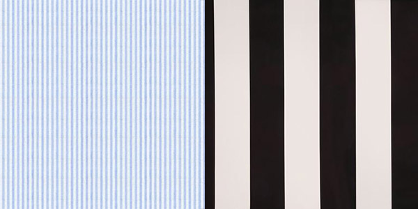
Comes in many different scales, from pinstripe (thin) to the wide repp stripe you find in ties.
Really flexible, easily worn with other patterns and of course, goes with all solids.
Pattern #2: GINGHAM
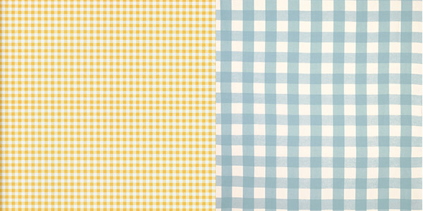
Also known as a “check” pattern.
Also comes in many different sizes, from mini to large scale
Mostly seen in
Pattern #3: PLAID
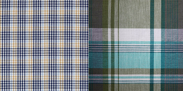
You’ll find many different styles of plaid (all with different names), but for the sake of this article, let’s just lump them all under one title.
Plaid scales vary, but as a whole, plaid prints are typically more busy because of the color plus the actual plaid pattern itself.
Make sure to use plaid sparingly. One plaid item per outfit is usually best.
Pattern #4: DOT
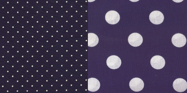
Many different scales available, from small pin dot, to very large dots. If you’re going for a more refined look, stick with smaller scale dots. Great for
Dots are fairly flexible as well, and you can achieve different looks depending on the contrast between the garment and the dot pattern. Some dots are close in tone to the
Pattern #5: PAISLEY
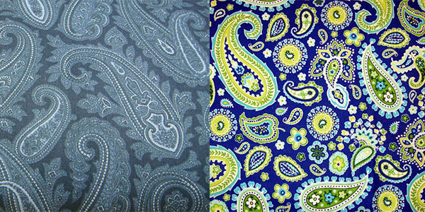
Paisley is up there with plaid, as far as the amount of visual attention it commands. Great with ties and
If wearing a busy pattern such as paisley, make sure to stick to solid colors for the rest of the outfit. If you want to experiment with paisley but are hesitant, find a
Pattern #6: HOUNDSTOOTH
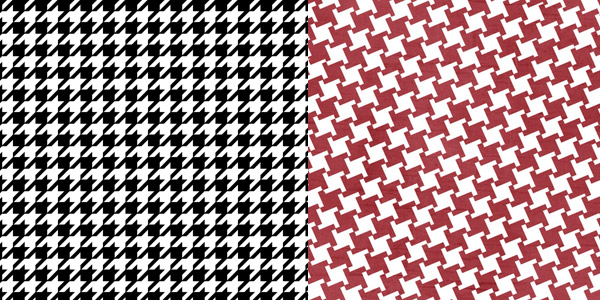
Houndstooth is a pattern you’ll find everywhere, from
You can wear houndstooth head to toe if you know how to do it right. Stick around and we’ll figure out how further down.
Pattern #7: HERRINGBONE
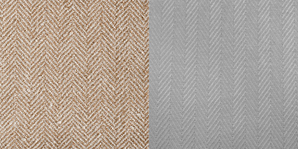
Herringbone is another common pattern you can find in
You can find herringbone in varying scales, though in
There are plenty of patterns out there, but I find these seven to be the most common. If you can master the use of these, those other patterns you come across will be a piece of cake.
How to wear patterns in your outfits
It’s important to start simple. If you try to put together an outfit consisting of several different patterns of varying scales, plus making sure all the colors complement each other, you’re sure to be overwhelmed.
Before we get to that, here are some…
Points To Consider
CONSIDER SCALE. Smaller scale patterns are easier to pair with other patterns and bold colors. Larger patterns need to be on their own, otherwise your outfit may look too busy and clash. Not good.
CONSIDER COLOR. Focus on the most prominent color when trying to complement the other colors in your outfit.
LET THE PATTERN BE YOUR MAIN FOCAL POINT. If you’re wearing a bold, dotted tie for example, let that be the only attention-grabbing pattern on your body that day. As you advance, you can strategically include other patterns, but tread carefully if you’re just learning.
Start Simply = Start With Your Shirt
For now, let the
Is your shirt a solid color?
Find a tie with the same color “in the background”, i.e. the minor color of your tie. For example, if you’re wearing a light blue
This isn’t imperative, but I’m using this as an example to illustrate the simplest way to pair your
Is your shirt patterned?
Yes? Okay great.
Is the shirt pattern small scale?
You can wear a bold, patterned tie. This will contrast nicely with the subdued pattern of your
Is the shirt pattern large scale?

Do the opposite to maintain that balance. Choose a small, subtle pattern for your tie, suit, and everything else you’re wearing. Let the large scale pattern on your
Easy shirt patterns to use as your base
The key here is keeping your scale small, and your color tonal.
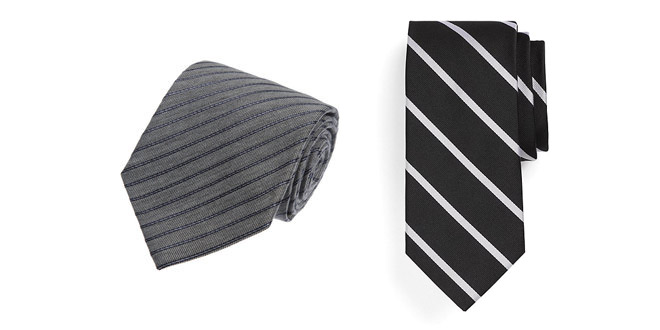
The photo of the ties above is the perfect example of what I mean. You can easily see the difference in contrast between a black and white stripe tie versus a tonal light gray / dark gray tie.
Try squinting a bit, and the tie on the left just looks… gray. The black and white stripes on the right are still clearly visible.
What’s the point? When it comes to your
Here are some examples of a mini pinstripe
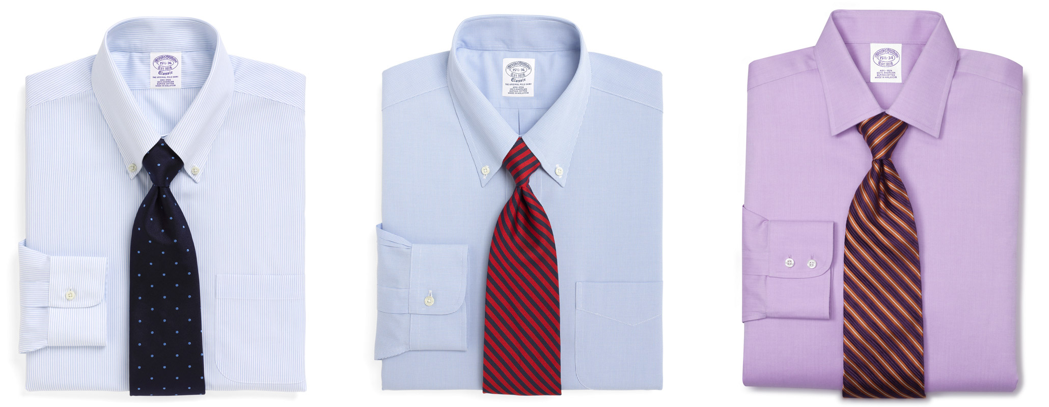
Pretty cool, right? These
The pattern adds a bit of texture to your
Start Small, Work Your Way Up
 There’s a rule of thumb I heard somewhere, and the essence of it is to start with smaller patterns closest to your body, and work your way up (in scale, color complexity, and intensity) from there.
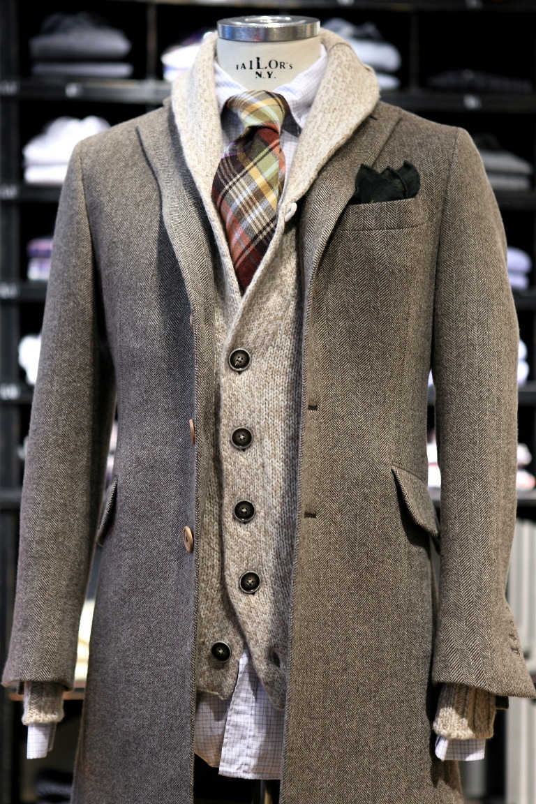
First off, it’s easy to work multiple patterns together if your base–the clothing closest to your body, (e.g. your
So for example, your tie can be more bold than your
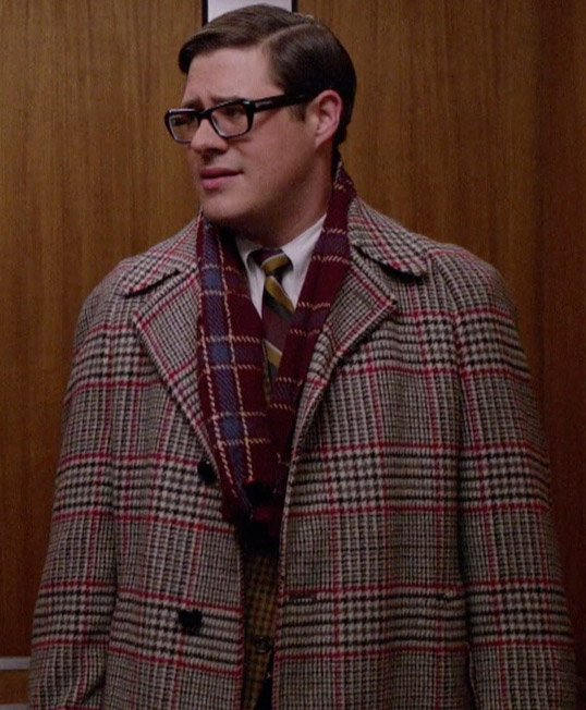
Your overcoat can be a standard solid color, or you could do something interesting with another bold print (like Harry Crane, the confused looking fellow in the photo).
See what I’m saying? Small patterns closest to your body, largest and boldest patterns furthest away from your body. Layering. Brilliant!
Pattern + Color: A few more key ideas
Incorporating pattern adds a new level of complexity to constructing an outfit.
Not only do you have to worry about color among your various articles of clothing, you now have to consider the pattern’s color as well, not to mention its scale.
Heavens! What’s a budding style student to do?
First off, take a breather. It really isn’t that difficult once you get the hang of things. If you’ve made it this far in the article, you’ve already consumed a good amount of information that will make it easier for you to work in pattern the next time you put clothes on.
As far as harmonizing color with pattern, keep these two things in mind. Let’s use the
Take the tie pattern’s minor color, and match that with the most prominent color of the shirt .
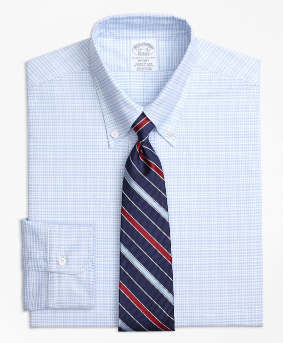
If your
Take the tie pattern’s most prominent color, and make sure it matches or complements the boldest color in the rest of your outfit.
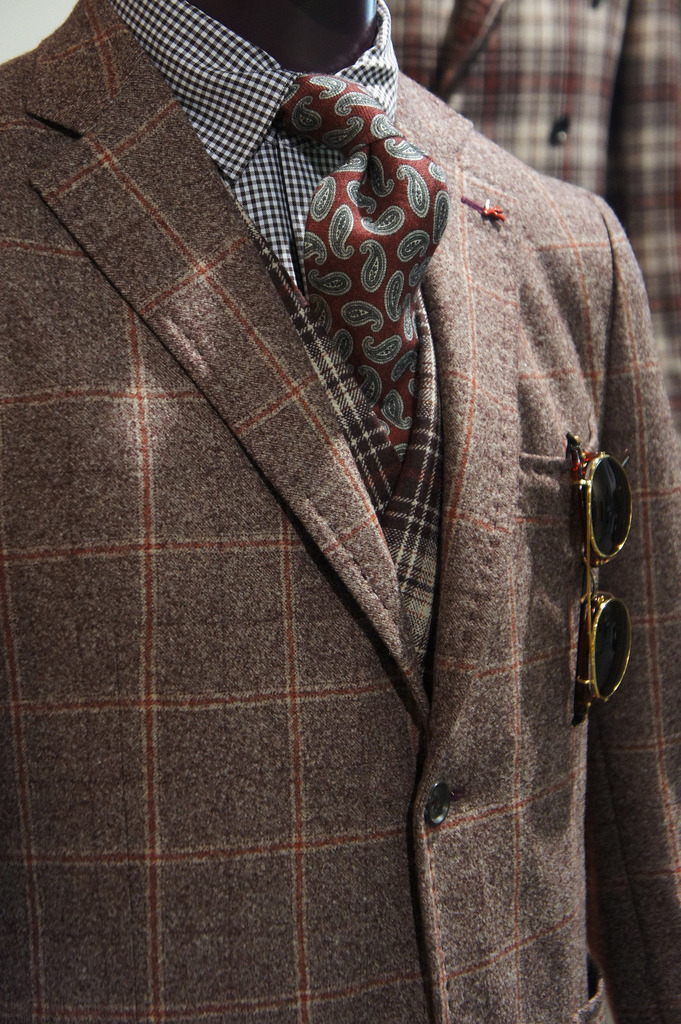
See the above example. The paisley pattern’s color closely resembles the
I guarantee the stylist didn’t think too hard about this. After a while, you develop that eye for what works, and it comes naturally. Just keep practicing.
Anyway, these are two different approaches you can take to making sure your outfit looks well put-together. While I never advocate exact matching, making sure colors play nicely together is always important, especially when incorporating patterns that may have multiple colors within it.
One Final Do’s and Don’ts List
Do:
- mind pattern scale, especially when pairing with other patterns (remember: start small and work your way up in scale, color complexity, and intensity)
- wear solids (or small scale patterns) as a base for your bolder patterns
- mix small patterns with larger scale patterns
- start small when you first begin experimenting (i.e. a solid suit + patterned
shirt , solid dark-colored chinos + dottedshirt , or small scale patternshirt + bold patterned tie) - balance bold patterns with more subtle patterns, and vice versa
Don’t:
- wear two similarly bold patterns of the same scale in one outfit, as the outfit becomes too busy
- wear two different patterns of the same boldness and scale; those two items will compete with each other visually
- wear different plaids in one outfit; stick to one plaid item, keep everything else solid (see Mr. Murray as an example of what not to do… unless you are Mr. Murray, then you can do whatever the hell you want)
- wear the same exact pattern as a top and bottom (unless it’s something like a stripe or check suit).
Finally
Hopefully these tips and pointers help you incorporate pattern into your outfit more often. Doing so adds a bit of dimension and interest to your outfits, much more than solid colors can do on their own.
If there’s one main takeaway from this article, it is to start small by adding pattern to ONE piece, keeping everything else a solid color. As you get used to playing with color and pattern, you can experiment with varying scales and layering everything together.
Got a question I didn’t answer here? I’d love to hear them in the comments below, so leave em!
[photo, photo, photo, photo, photo, photo, photo, photo]